
Why Reporting Is Sexy
Quick question for the group, what is the sexiest part of marketing?
Creative, sure. Strategy, I can see it. But it’s the results baby. The results are where it’s at.
But what good are results if you don’t have a way to clearly communicate and show them off? Enter, reporting.
Reporting is one of the most important parts of any marketing campaign and is often overlooked when it comes to excitement and looks. Here at SRH we take reporting extremely seriously, and we’ve made hundreds of custom reports over the years. We want to share a few of the key pieces that stay consistent across all of our reporting to keep it digestible, results-focused and fun! These are client tested and client approved.
May seem obvious, but it’s not. An actionable insight is something gleaned from the data that leads to a direct action or next step. Let’s take a look at a couple of examples.
General Insight: The ad with the girl did 4x better than the ad with the boy.
Actionable insight: Because the girl creative is currently performing the best, we want to look at our audience and see if women engage more than men, and want to drive more budget to the girl creative.
The first insight is succinct, but it also only conveys performance, not how to capitalize on it. The actionable insight is a little longer, but it touches on performance and next steps. We find it’s best to have a few actionable insights, then more general ones. This also helps stakeholders understand how the campaign is being adjusted as you go.
We all know that we need data to show how campaigns are performing, but not all data visualizations are created equal.
Let’s say you want to communicate MoM growth in leads. You could make a simple table like this:
| Leads MoM | |||
| November | December | January | February |
| 15 | 20 | 28 | 41 |
OR you could make a high-impact graph like this:
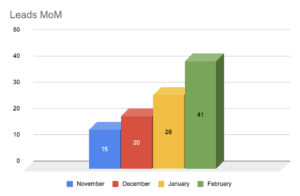
What we like about the visualization of the graph, is that at a glance you can see upward movement. It doesn’t take a deep dive in order to clearly see results. Plus, it just overall looks more exciting.
If you can’t always fit in a graph, then we suggest adding a qualifier to your table, like % increase from the previous month, with a color code. Like the one below:
| Leads MoM | ||||
| Month | November | December | January | February |
| Leads | 15 | 20 | 28 | 41 |
| % Increase from previous month | 25% | 33% | 40% | 46% |
But remember, just having a graph or table won’t cut it. Data is a great tool to help you demonstrate you’re skating where the puck is going, but should always be paired with an actionable insight.
Having a clear setup at the start of reporting helps get your team in the proper state of mind for reviewing results. This can include key takeaways, an executive summary or a campaign visualization or funnel. Whatever works best for your group. For some, it may be helpful to include some vocabulary in case the group isn’t totally familiar with some of the marketing jargon.
And at the end of your report, having clear next steps is a great way to keep yourself and your team on track. We like to include the previous next steps in our reporting as well, to help show progress or tie in key learnings.